Hello All,
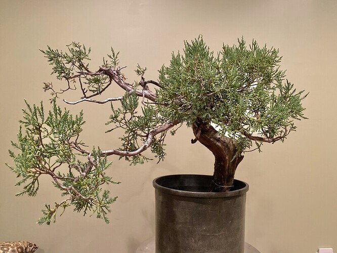
I’m hoping to begin the work on this RMJ this weekend and wanted your opinions on my design visions. What to you think of my renderings and what would you suggest? (There is a disconnected piece of deadwood that I will re-attach at the base during repotting)
To me the first sketch looks more natural. New branches growing in the same direction as the flowing deadwood.
In both the apex is relatively close to the centerline of the base, I feel this works better in the second design. On the first I think moving further left might as a bit more design drama, and make it a bit more exiting.
Great work on the sketches! They look awesome!
Good luck!
I actually prefer the second design. Dropping some foliage into the negative space on the right next to the deadwood on that side draws the eye to that deadwood feature, and gives the composition more balance. Gorgeous.
I also like the second sketch more. They are both beautiful ways to go.
Whilst both will work very well, for me dwng 2 is the best way. To me it seems to make the tree look bigger.


