For those that are not aware, the critiques of each tree at the Artisan’s cup is available online. It is a fantastic resource to study design and display. I highly recommend that you use it. I am doing my critique of each tree after reading the text below the composition that sometimes is provided by the author. However, I do my personal critique before I listen to the critiques by by Colin Lewis, Boon, Peter Warren, Walter Pall and David DeGroot. I would like to discuss in this post the winner in 3rd place. I pasted the photo below and you can listen to the judges critique in this link.
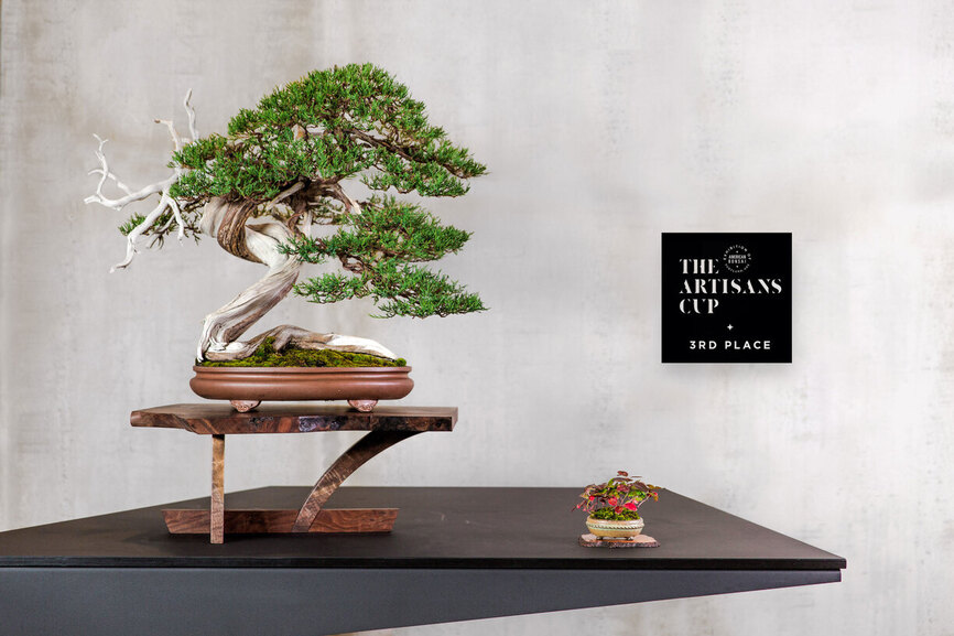
Display: I like the arrangement, the wildness of the stand, the contrast of the colours of the companion plant and the tree even if it is a species that would not be observed to grow together with the juniper.
Pot: I like the shalowness but I find the colour too distracting and particularly the feet too big making a composition that seems too top heavy and thus a bit unstable, more so. I really like the fact that there is no lateral room in the pot, that the base occupies the entirety of the pot. I think that this really adds to the composition. I’d choose an equally shallow oval of the same size, perhaps straight profile and a more greyish plain colour that seems rustic like the stand and serves as a transition between it and the tree. The sharp turn with a straight but perhaps slightly outward slanting profile would give a feeling of being planted at the edge of a cliff. Lastly, I’d definitely use a pot with very little to no negative space between the pot and stand in the front.
Tree: I really love the landscape feel created by the raft style of the base, almost alluding to a penjing mountain landscape. It almost has the feel of a root over rock composition with the beautiful movement of the raft-style base and the interplay of live vein and deadwood. Like I mentioned, it is super important that the tree is really touching the edge of the container laterally. I absolutely love everything about the trunk of this tree. The interplay between live and deadwood, the twisting live vein. As for the foliage, The cascading defining branch on the right makes this tree shine. To discuss the rest of the foliage, I’d separate it into two sections, the apex defined on the right side by the trunk line coming down slightly diagonally and visible in the photo and on the left side by the negative space just above the foliage pad just in front of the two deadwood antilope horns. The second part being defined on the left by that pad and all that is under the rightward going branch that defines the apex. I find the apex entirely superfluous. I would jin all of it. The new apex would be defined by the foliage right at the point where that rightward going branch of the apex emerges from the trunk and it would be a very small apex so most of the foliage to the left of it would also be removed and the remaining top section slightly rearranged. This would create a tree that is a a lot more feminine and sinuous with a lot more deadwood on top and all the foliage to the right of the trunk, nothing on front back or top.
This is a super special tree and the creator of this composition got a lot of it spot on to create such a dramatic representation of nature but I feel that the broad apex and traditional pot are not au pair, this tree did not reach its full potential yet.